Excelerate America: Building a Sustainable and Scalable Design System
Tools: Figma, Storybook, Git, and Hygraph
Mar 2022 - May 2022 (iteratively updated till 2023)
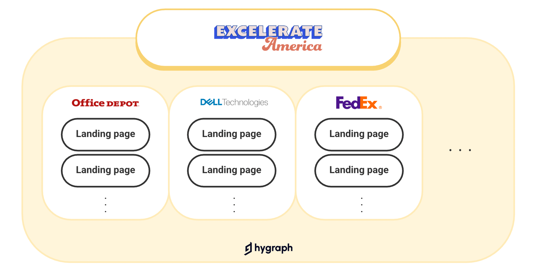
Excelerate America is a group purchasing organization platform for businesses that partner with Office Depot, Dell Technologies, FedEx, etc. Customers sign up for one of EA’s group purchasing programs to cut business expenses. EA’s leading platform is a web application built with Hygraph - a white-labeled content management system.
Overview of Excelerate America Platform
The website is powered by Hygraph, a white-labeled CMS software. In addition to key pages, there are numerous landing pages introducing partner programs. As EA continues to onboard more partners and programs, the team needs to create these landing pages quickly to expand their reach.
Challenges
However, the system was not fully equipped to generate landing pages as quickly as the team desired.
Customization Limitations
Hygraph is still a white-labeled solution, requiring a design system to build the site. When setting up Hygraph, we chose Chakra UI, which lacked Excelerate America's branding elements.
Slow Page Creation
If a landing page required custom design elements outside of Chakra UI, the creation process took significantly longer—at least three weeks.
Marketing & Sales Urgency
The Marketing and Sales team needed to release at least two new landing pages per month to drive new account acquisitions.
Goals
Build a new Design System
Establish a process of creating landing pages for non-designers
Process
However, the system was not fully equipped to generate landing pages as quickly as the team desired.
Design System
Foundations
Design System
Components
Design System
Blocks
Design System
Pages
Process of Creating a landing page
Instructions
Outcome
Comprehensive Coverage:
EA’s new design system encompassed all components, blocks, and pages without requiring custom elements.Consistent Design:
The system ensured visual consistency across the product.Faster Development:
The page-building process significantly improved, reducing the time from 3 weeks to just 1 week.Empowered Teams:
Marketing and Sales teams could add many more pages independently without relying on engineers and designers.
What I learned
Collaboration is Key
Collaboration between engineers and designers is essential for creating a successful design system. From planning to scoping the project, engineers and I worked closely together, sharing ideas and discussing solutions whenever necessary. It’s important that design and engineering disciplines merge into a cohesive unit.
No One-Size-Fits-All Design System
There is no universal answer for what a design system should be—it can vary in complexity based on factors like the number of products, types of platforms, and specific use cases. Designers and engineers should collaboratively determine the appropriate scope based on thorough research and the team’s needs.
Iterative and Collaborative Updates
As platforms grow more complex and require new components, the design system should be updated iteratively and collaboratively by the team. Continuous refinement ensures it stays relevant and scalable.


