Cardoc: Improving User Engagement
Mobile App Design (iOS & Android)
May 2016 - May 2017
# of users: 850K
# of repair requests: 300K
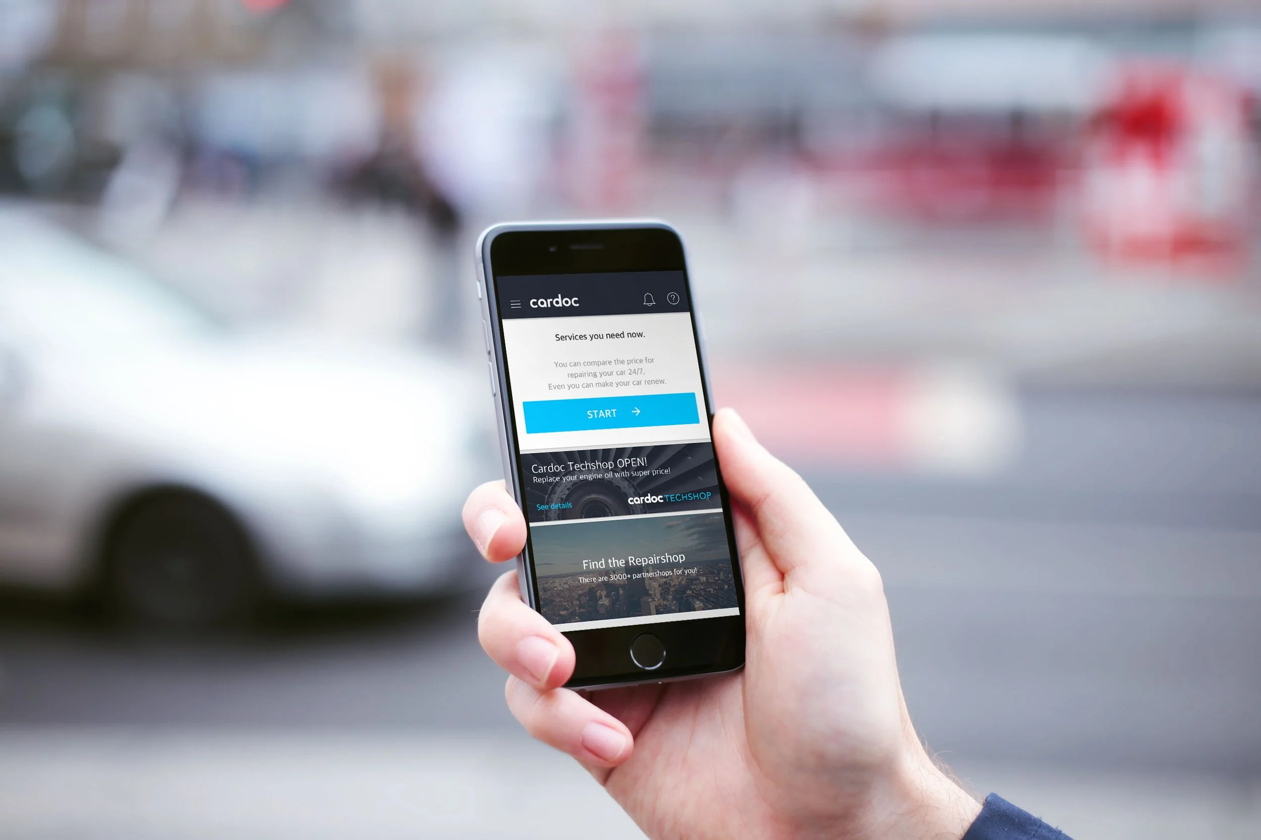
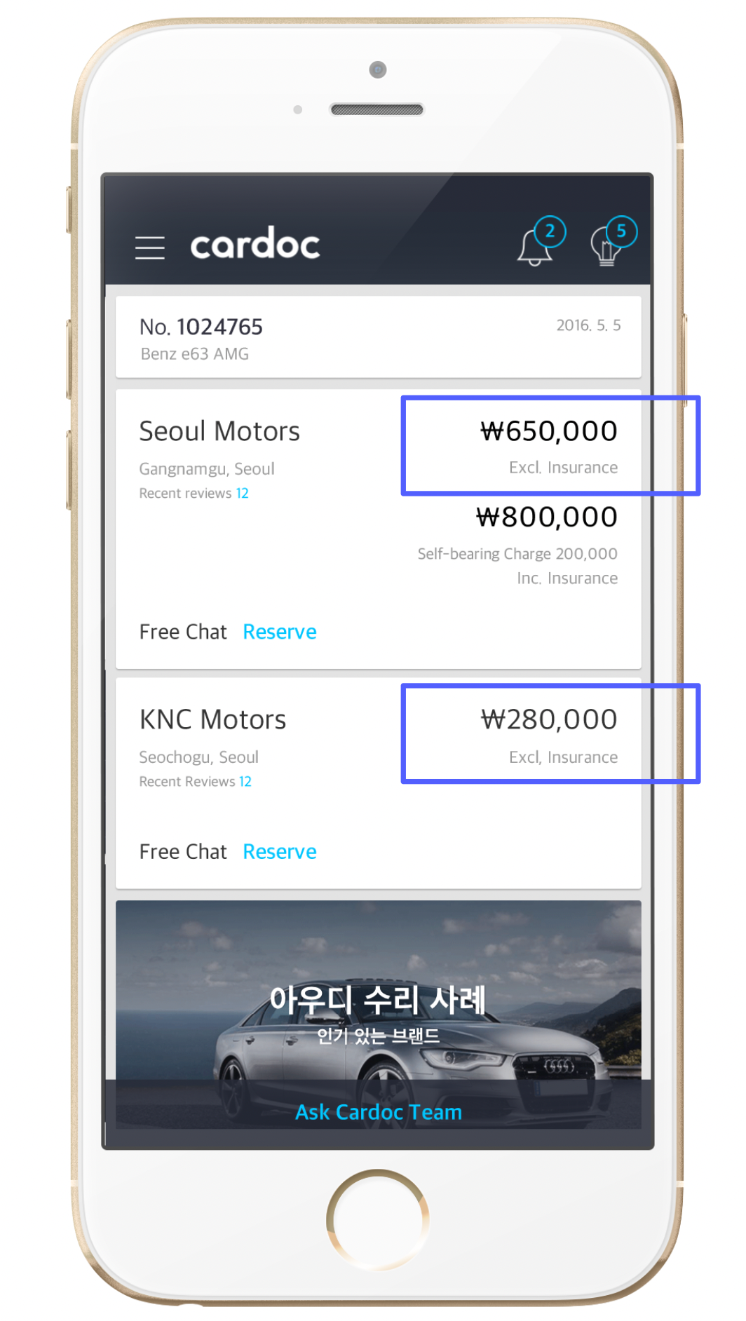
Cardoc is a car repair service, that guides users to repair their vehicles. Users upload one or two pictures of the damaged area of their cars. Within a few minutes, they get several quotes from the partner body shops. After comparing the bids, users can choose the shop, proceed to repair, and make payments through the app.
My Role: Product Designer. Worked as a solo designer while actively collaborating with a product manager and engineers to iterate the design through multiple releases.
Overview of Repair Process
Problem #1
The Customer Service team received numerous calls from customers asking why different shops suggest varying prices, whether the shops are trustworthy, and how to choose the ‘right’ shop for their needs.
Problem #2
Throughout the entire repair process, the conversion rate from Quotes List → Quote Details was significantly low at around 40%, whereas other conversion rates, such as requesting quotes, were as high as 80%.
Chellenges
Each card's design should be enhanced to highlight its unique features and provide sufficient information to help customers make more informed comparisons.
The card design should appear more clickable to increase the conversion rate. A low conversion rate can result in a reduced repair completion rate, directly affecting business goals.
How might we …
convey sufficient information about the shop?
improve the conversion rate?
make the card look visually clickable?
Iterate Design & Validate Solution
Throughout the year, I released four different versions of this listview. I conducted multiple UX research to add various features: a visual indicator for new quotes, profile picture, promotion keyword chips, distance, divider, and label button for viewing the quote. After every release, I checked the number to see what the user's reaction was like.
User Research & Design Rationale
Comparative Analysis #1
Visual indicators, such as small dots, help users easily identify new messages on social networking apps like Messenger and Messages.
→ Add a visual indicator for new quotes
Comparative Analysis #2
On business review platforms like Booking.com and Yelp, photos and logos are displayed on the left side of the card, helping users easily recognize the business among multiple listed cards.
→ Add a profile icon
Stakeholder Interview
Repair shops wanted to differentiate themselves from others by offering unique services, such as free carwash and weekend service.
→ Add promotion keyword chips
User Behavior Observation
Users frequently clicked embedded Google map in the repair shop detail page, which requires 4 clicks.
→ Add a distance
Heuristic Evaluation
The other two text buttons had no issues with their conversion rates. Adding the 'View the Quote' text button ensures that all three buttons maintain a consistent visual hierarchy.
→ Add a button label
Organize the card design more effectively by dedicating the bottom part of the card to clickable options.
→ Add a divider
The primary blue color was overused in too many areas to highlight information, causing the unread quote indicator to not stand out as intended. Additionally, the grey color on the icon had insufficient contrast with the white background.
→ Change the new quote indicator
→ Update the arrow icon color
Outcome
The conversion rate increased to more than 70%. Initially, it was less than 40%.
The customer service team gets fewer calls asking for quotes.
What I learned
Measuring the impact of design with simple metrics
Users don’t always explicitly articulate their challenges
Aligning the team on key goals


