Cardoc Partners: Converting website to native mobile app
Mobile App Design (Android)
May 2015 - August 2015
# of Shop Admin users: 120 (95% Android, 5% iOS)
Active users: 89
Shop Admin and Cardoc Partners are business management applications designed for Cardoc repair shops. The primary users are repair shop mechanics.
As the Product Designer, I led the design efforts, collaborating closely with a developer, a product manager, and the CPO as part of a dedicated task force team.
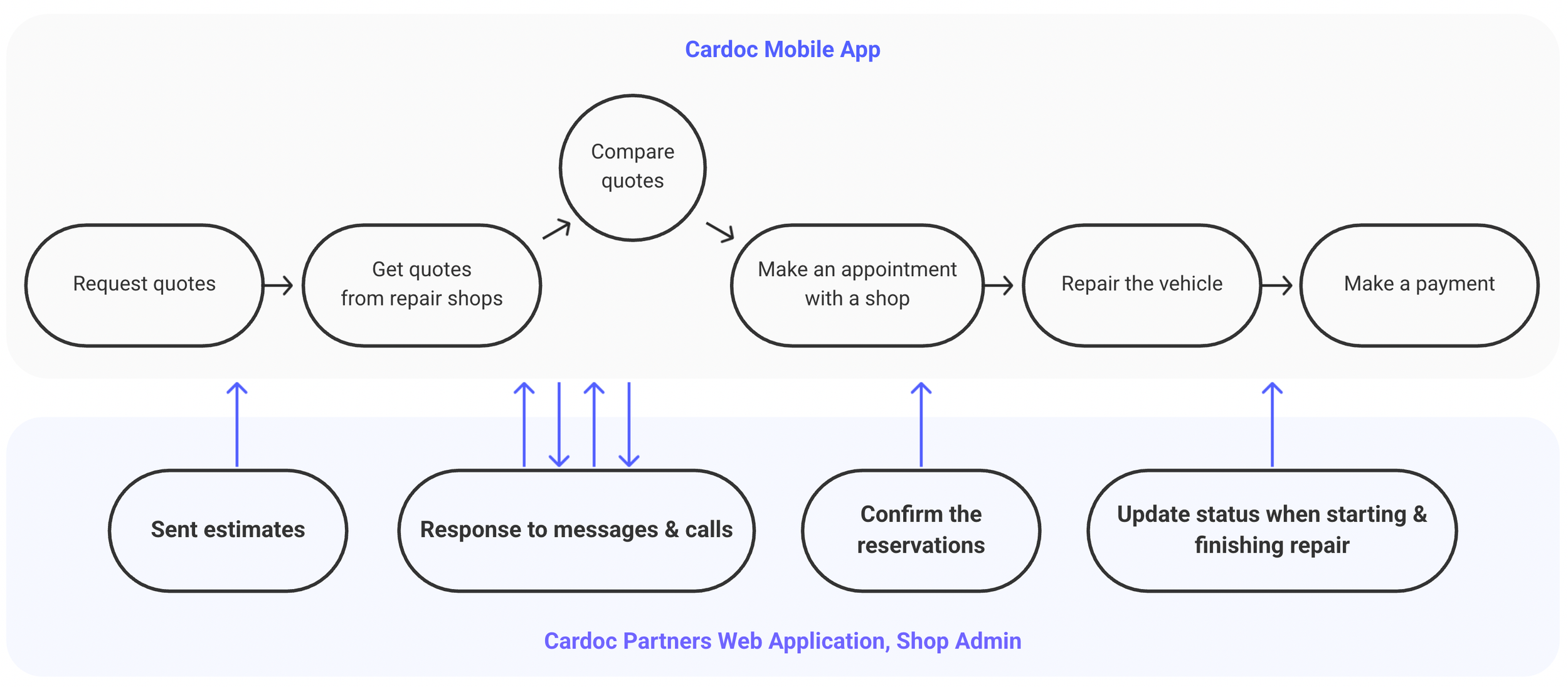
Interaction between Cardoc and Shop Admin Website
Problems
The web application lacked support for real-time communication between customers and mechanics. Consequently, customers faced long wait times to receive responses from shops, whether for quotes or messages, which prolonged the repair process. As a result, mechanics preferred to communicate with customers via text messages or messenger apps on their phones instead.
User Research & Pain Points
Cardoc Customer Service cannot track the repair process when conversations occur outside the Cardoc app.
Over 80% of users access the web app on their phones to write quotes. However, the app requires extensive scrolling on mobile screens, which leads to inefficient actions and time-consuming tasks.
114 shops out of 120 (95%) are using Android devices
How might we …
provide communication experience better?
reduce inefficient clicks and task completion time?
design an application providing easy use on mobile devices?
The Goals
Designing new communication features; to enable real-time interactions between mechanics and customers.
Creating an optimized quote management flow for efficient mobile use; for reducing scrolling and improving task completion speed.
The Design & Test

Final Design; New Communication Features
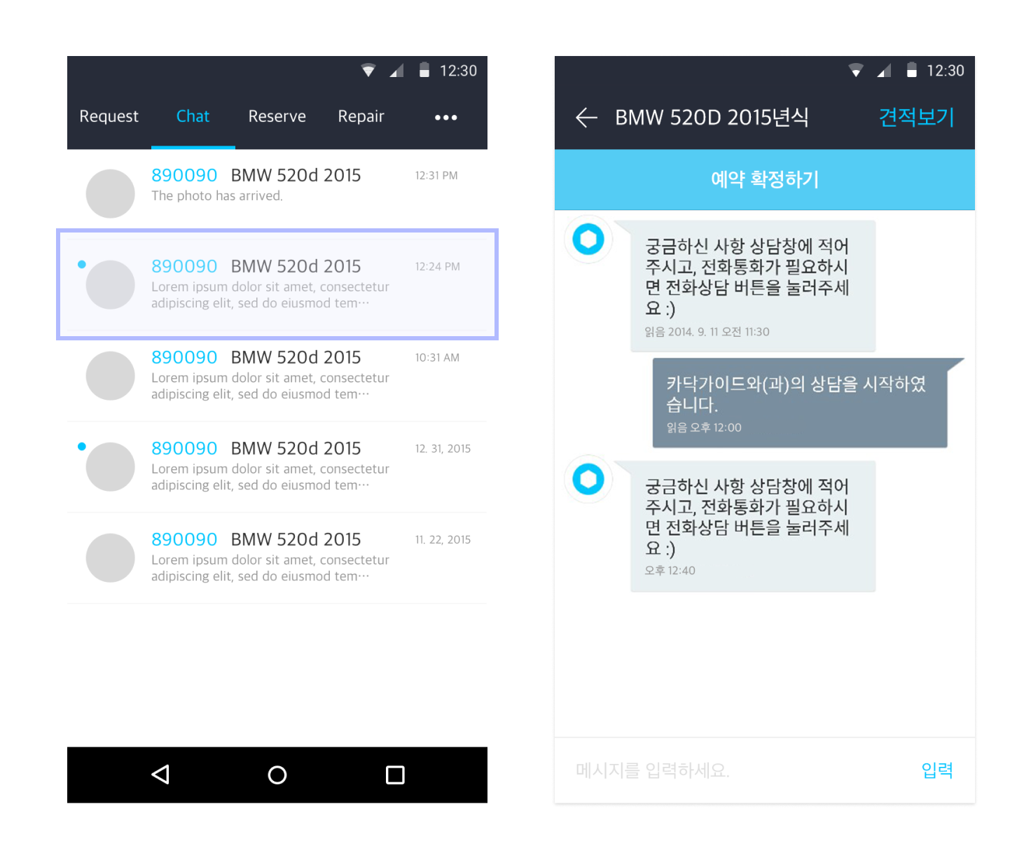
Real-time notification
Designed it to resemble common messaging apps, ensuring a familiar experience so users don’t need to learn a new interface.
Caller ID
If an incoming call matches a quote in the app, the pop-up displays the customer’s vehicle photo, type, and repair status.
The reason I added the Caller ID is that while observing the daily operations of repair shops, I noticed that mechanics often took additional time to verify customer details before giving updates over the phone. This Caller ID feature helps reduce customer wait times and makes communication smoother.
Final Design; Organized Quote Mangement
Before (on Shop Admin): Quotes were listed chronologically, requiring mechanics to use filters or navigate multiple pages to find relevant quotes.
After (on the Cardoc Partners Android): Quotes are organized by repair status, allowing mechanics to:
Quickly confirm reservations
Instantly find quotes for ongoing repairs
Easily update the repair progress
This eliminates unnecessary scrolling and filtering, making mechanics' workflows much faster and more efficient.
Final Design; New Flow of Quote Writing
Key Improvements
Fixed vehicle photos at the top: mechanics no longer need to scroll up and down to reference them when writing quotes.
Minimized Scrolling – Scrolling only occurs at the beginning (to review details) and at the end (before sending the quote).
Reduced the number of clicks – Compared to the Shop Admin site, which required at least 14 clicks for two parts to repair, the new app reduces it to 11 clicks.
These refinements eliminate friction and allow mechanics to complete quotes faster and more efficiently.
Outcome
Additional features added
Announcement board to partner shops
Group purchasing program for miscellaneous items
Auto parts purchasing program
Repair shop marketing tools
Project Retrospective
This project taught me a lot about collaboration and moving quickly with limited resources. Especially while managing other ongoing projects, I realized that strong collaboration is critical. I’m still grateful to have worked with such an amazing team. I never doubted their capabilities or motivation. I learned a great deal just by working alongside them and seeing how everyone stayed engaged and believed in the project’s outcome. Engagement and shared belief are key to driving successful projects.
Additionally, I learned that sometimes the best answers lie outside the domain. Our mantra of being bold and experimental led us to find better solutions.
I also learned the importance of measuring design impact in alignment with the project's original goals and challenges. Since communication was the primary issue, I focused on assessing how effectively it improved, which provided a clear framework for evaluating the project's success.


