Cardoc: Improving User Engagement
Mobile App Design (iOS & Android)
May 2016 - May 2017
# of users: 850K
# of repair requests: 300K
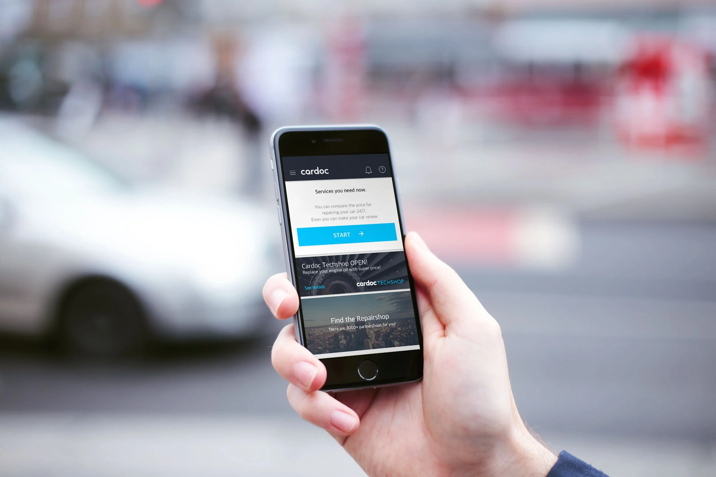
Cardoc is a car repair service, that guides users to repair their vehicles. Users upload one or two pictures of the damaged area of their cars. Within a few minutes, they get several quotes from the partner body shops. After comparing the bids, users can choose the shop, proceed to repair, and make payments through the app.
My Role: Product Designer. Worked as a solo designer while actively collaborating with a product manager and engineers to iterate the design through multiple releases.
User Research & Pain Points
“Users can’t choose the ‘right’ shop.”
Each shop suggests a different price. When it’s cheaper, it seems suspicious and users are likely not to trust them. When it’s expensive, it seems unreasonable compared to cheaper ones.
All in all, users need more information to compare those different prices. Then, how can they do it?

Define Problems & Set Goals
The quotes can vary depending on the repair methods that body shops choose to implement and their price range. To learn more information about the quote, users had to click the card to reveal more details.
Problem #1
The conversion rate (from list view to detail view) was very low, which means users don’t see enough information to make the right decision.Problem #2
The card is not recognized as a clickable element.
How might we ...
help users trust their quote selection?
improve the conversion rate?
make the card look visually clickable?
Iterate Design & Validate Solution
Over a year, our team tried various ways to improve the screen by adding an unread mark, a chevron icon, a divider, and a text button on each card. Also, promotions, distance, and avatars were added so that users can obtain more information from the shop before clicking.

User Research & Design Rationale
Comparative Analysis
Profile photo: Restaurant review apps like Yelp or Foursquare often show photos from users’ reviews.
Small dots on the new quote: It’s a feature from many messenger apps for unread messages.
Stakeholder Interview
Promotion Keywords: Partner shops wanted to be differentiated and stand out among quote lists by showing their offers.
User Behavior Observation
Distance: We found that users often click the shop's information to find out how far the shop is from their place.
Heuristic Evaluation
Button label: Since the “채팅상담 (Message)” and 예약하기 “(Reserve)” buttons had no problem with the conversion rate, we made “견적서 보기 (View the quote)” into text button to make them have visually same level.
Divider: It made the bottom part of the card for clickable options.
Outcome
The conversion rate from the quote list view to the detail view increased to more than 70%. Initially, it was less than 40%.
The customer service team got fewer calls from users who are unsure about quotes or body shops.

What I learned
Collecting data is important to measure the impact of the design.
Using agile development is important to update the service according to users’ feedback.
Collaborating with developers throughout the updates while other projects are ongoing was critical.